Genius!:

Genius!:
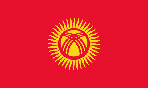
![]() Like many others, it seems, I’m not wild about the new logo that Interbrand has trotted out for Xerox. I think the typography is pretty nice, but hate hate hate the clunky, overdone, and seemingly pointless and trendy (in the really bad way) ball sitting there on the end. Even worse, it seems as if the whole marble-like thing is just a bad rip-off of the slightly goofy but certainly more dramatic flag of the former Soviet republic of Kyrgyzstan:
Like many others, it seems, I’m not wild about the new logo that Interbrand has trotted out for Xerox. I think the typography is pretty nice, but hate hate hate the clunky, overdone, and seemingly pointless and trendy (in the really bad way) ball sitting there on the end. Even worse, it seems as if the whole marble-like thing is just a bad rip-off of the slightly goofy but certainly more dramatic flag of the former Soviet republic of Kyrgyzstan:

(Originally uploaded by pauldhunt.
I was just talking to my mom, who was reminding me to pack warm clothes when I head home next week. I hadn’t yet forgotten what winter in upstate New York would be like, but it’s not a bad reminder when this is what winter looks like here.
(Photo taken by my flatmate Paul, who knows a thing or two about cold winters in New York state.)